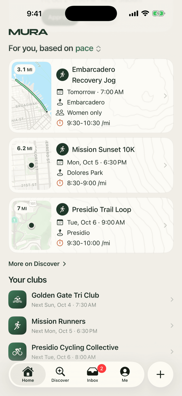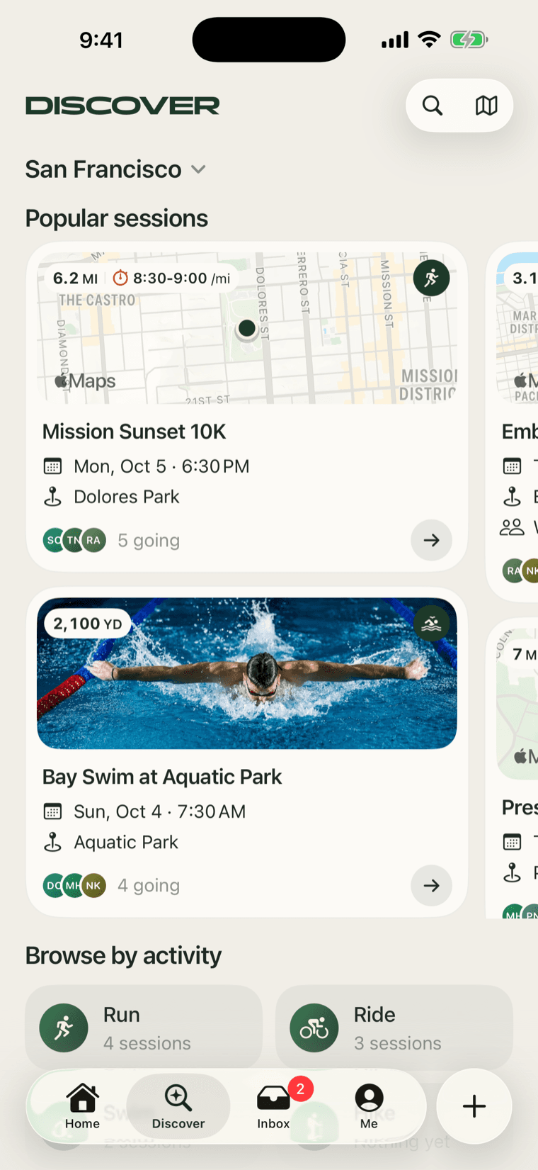
A week ago the honest feedback was that the app felt a little flat. The rows were fine, the pages were fine, and nothing made you want to tap. The request that came with it was specific: rounder cards, and the map back as the lead picture, at least for the athletes who care about the course. Today the new card family is in the app. This is what changed and the two or three things we had to work out to get there.
The ladder
Every session card, at every size, shows its place. The picture is chosen by a ladder:
- The host's cover photo, when there is one.
- Else the route, drawn on a map.
- Else the meeting point, pinned on a map.
- Else, and only when the session has no location at all, the activity's art.
A session that is a run around the reservoir shows the reservoir. One that meets at a café shows the café. Nothing shows a generic illustration because the host did not upload a photo.
Pictures, not live maps
The maps on the cards are not live maps. A list with twenty live maps in it scrolls like mud. Each one is a picture, rendered once and kept, in a muted style with no shop names or pins of its own, and in a dark version for a dark card. We draw the route on top ourselves: a pine line with the mint line inside it, a pine dot at the start, and an orange dot at the finish when the finish is somewhere else. A meeting point is a pine disc with a cream ring.
Once a card's picture has been drawn it is kept, so a card you have scrolled past never draws again.
The whole route, at any size
A small card and a tall featured card have very different shapes, and a route has to fit entirely inside both, with every part of it clear of whatever sits on top of the picture: the stats pill, the activity badge, and the Maps mark in the corner. So the framing is worked out for each card, not guessed: the route is fitted to the card's exact shape, as large as it can be with all of it inside the margin. We check every card size we have, and it is a bug if any part of a route leaves the frame.
The family
Four cards, one language. The surface is a soft warm white with the picture inset, round corners, and along the picture's top edge a small stats pill on the left (the distance, then the pace as a range if the host set one, behind a small orange stopwatch) and the activity on a pine circle at the right. Under the picture: the title, a calendar line, a pin line.
- Featured is the next thing on your calendar and the composer's preview.
- Standard is Popular on Discover: two to a column when there are four or more, one row under that, paging sideways with a peek of the next.
- List is the compact one for every list, with a chevron and no faces.
- Wide is a club page's upcoming sessions.
The featured and the standard end on a row of faces, "N going", and an arrow. Some calls made along the way, so they do not get relitigated: no standing pill and no host line on any card; orange only for the pace glyph and the finish dot; the stats chip small, after a first pass at the mock's size that was, in the words of the review, way too big.
The Maps mark stays
Apple puts its Maps mark in the bottom-left corner of every map picture above a certain size, and nothing moves it. Our first stats chip sat in that corner too, and the tail of "Maps" peeked out from under "3.1 MI", which looked like a mistake and was one.
So the chip moved to the top, and the mark shows on every card, whole. That turned out to settle a question we had been circling: whether a card needs its own credit line. It does not. Apple's is already there, on every card, and the OpenStreetMap credit sits where routes are drawn at full size.
What the first version got wrong
Our first pass, three days earlier, was a poster: the map filling the whole card, with a dark foot carrying the title. It photographed well and read badly. The title fought the map, a light map and a dark foot made every card heavy, and in a list of six it was a wall. The inset picture on a quiet surface is calmer and, in a list, far easier to scan. Flat was the wrong word for what the app had been. It had been quiet. It needed to stay quiet and gain a picture.