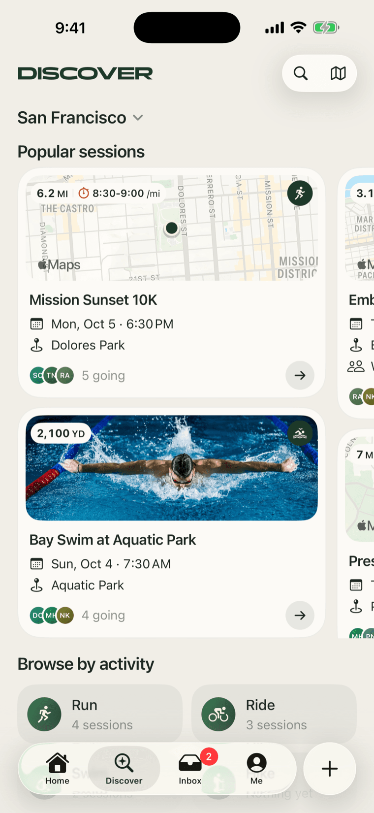
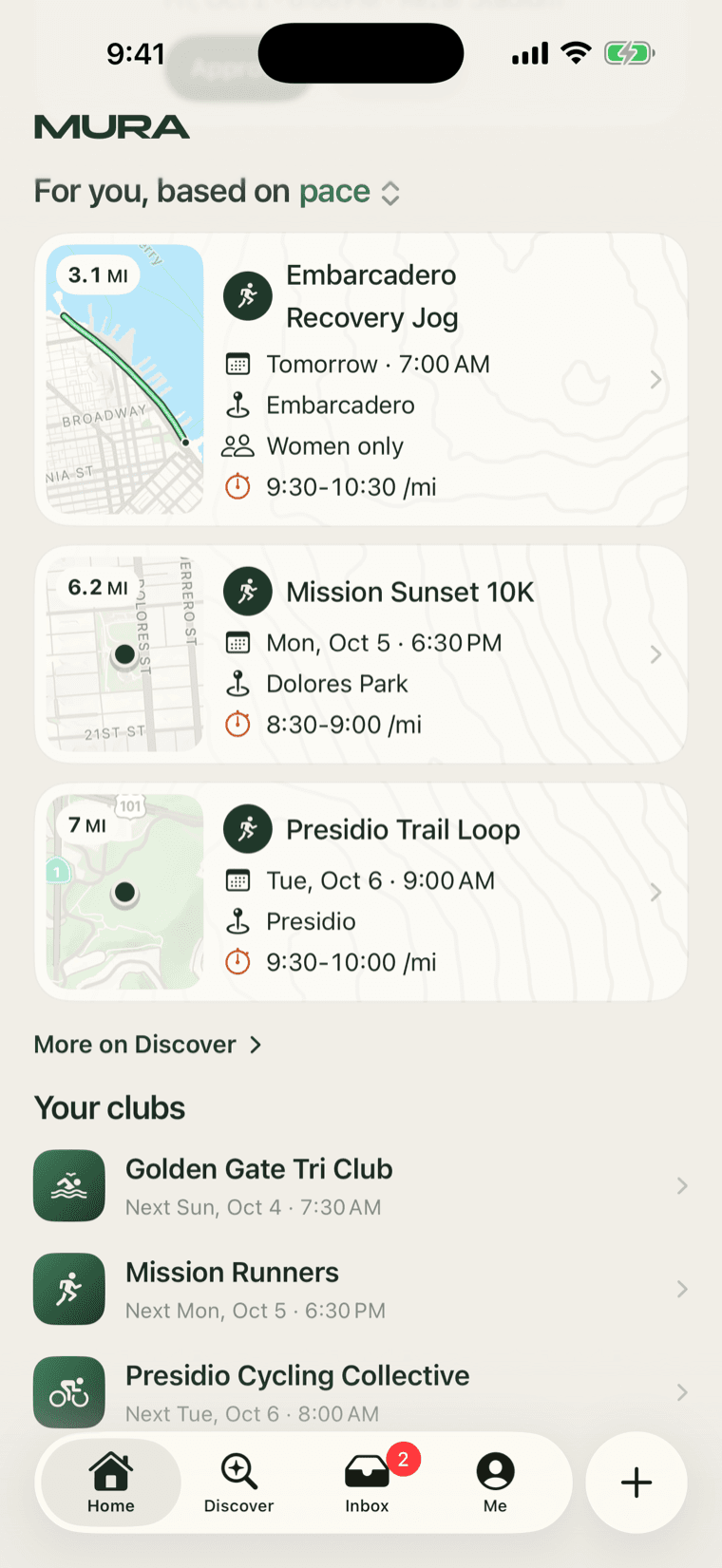
Last week we did something we should have done before the first app: we sat down with 29 apps and read how each one gets a person from "I opened this" to "I'm going". Event apps, dating apps, fitness apps, marketplaces. Not to copy any of them, but because discovery is a solved problem in a lot of places and we were solving it from scratch.
How we read them
We went surface by surface rather than app by app. The home feed, search, browsing by category, the map, the detail page, the empty state, and the moment someone is invited. For each surface we looked at what every well-regarded app does the same way, since that is usually the practice people have learned to expect, and where the ones we admire break from the pack.
Twelve practices showed up across almost everyone, but these are the ones that mattered the most for us.
The ones that stuck
One figure per row. Every row in a good list carries exactly one number in the same place: a price, a distance, a time. Ours is the distance for a run, the distance and the speed for a ride, or the length for a swim. The shorter and more to the point, the better.
The reason, in the person's own numbers. When something is recommended, the apps people trust say why, and they say it with the user's own data: "runs your pace (8:00-10:00 /mi)", not "92% match".
Sections as doors, not segments. The best discover pages we saw are one scroll where every section title opens a fuller page. Segmented controls at the top of a feed look tidy and hide half of what is there. Ours is one scroll now.
Media leads only when there is media. A detail page that opens on a generic illustration because there was no photo feels like a template. Ours opens on the cover when the host added one and on the title when they did not.
Faces are proof. Who is going matters more than how many. A row of faces at the right size does more than a count.
The empty state says what to do next. Not "no results". A sentence and a button.
The session page
The page you land on from a shared link is the most important screen we have, and here one event page stood above the rest. To our eye it is the best of its kind: a square cover, the title, the facts in pairs, then open sections over thin rules with no cards in sight. The first Mura already had a page in that shape. The new one is the same page, in the night palette, minus the topographic texture we had painted over everything.
From the top: the cover, only when there is a photo. The activity as a kicker and the title. The facts as pairs: Date, Time, Distance, Pace, Format, Spots, and You, which is your own standing. Then a row of tiles for whatever you can do here: a host gets Invite, Chat and Edit; someone going gets Chat, Can't go and Share. Below that, the sections: Location with the route on the map, the host, who is going, and About.
It has four states, and we drew all four before building: you are not in, you are going, you are the host, and it is over or cancelled. Each one changes the tiles and the bar at the bottom, nothing else. The page should look the same to everyone, with only the verbs changing.
What we did not take
Plenty of the apps we read lean on urgency: "3 spots left", countdown timers, a pulse on the join button. We left those out. A Saturday run with twelve people is not a flash sale, and the people we want are the ones who show up because the pace is right, not because a timer said so. Scarcity gets one colour in our palette, used rarely, and we intend to keep it that way.